

45 years of tradition continue to evolve with fresh, new ideas.
With a newly modernized logo and brand image, FS animal health (formerly Farm & Stable) is moving forward towards animal health.
The new logo is now more modern, clearer, and simpler. Reduced to a single color and designed in a new flat 2D style, it is versatile and adaptable. Icons and symbolism have been derived from the elements of the logo to create a clean and cohesive visual identity.
The new brand language is a significant departure from the previous F&S presentation: The focus is on the relationship between horses and humans. It's about the health of the animals under our care, and "we do everything to ensure our four-legged friends are well."
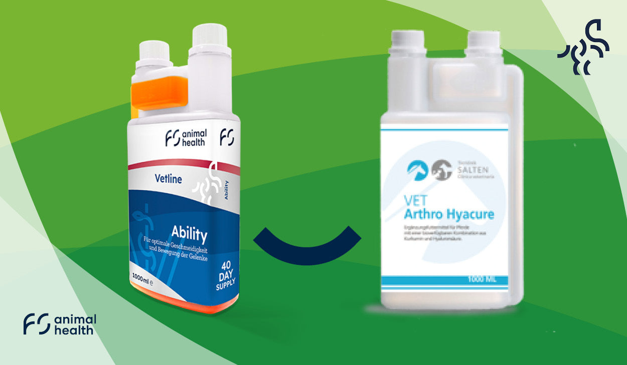
The new brand image is accompanied by new products for veterinarians and end consumers. The combination of new and familiar products in a creative, fresh design brings a breath of fresh air to the often stale world of equine feed.
Founded in England in 1975, Farm & Stable has a long tradition in equine health. Now, the distinction from the English sister company, Farm & Stable LLP, is clearer and prevents confusion.
The goal is clear: to be a leader in equine health.